2018 Color of the Year: This is No Shrinking Violet

A new year has begun, and with it, a new Color of the Year from Pantone: 18-3838 Ultra Violet. The 2018 hue is a bold and provocative color that conveys creativity, community, and discovery (both inward and outward). For lovers of color (like brand geeks and designer types), the Color of the Year has become a much-anticipated trendsetter as well as a representation of our collective “cultural vibe.”

Throughout the year, many businesses use the Color of the Year in small doses (branded images for social media, for example) to keep their brand current and fresh. This is especially fitting for creative-minded businesses such as interior designers and print shops, but can also work well used in engaging content for larger community-focused businesses, not-for-profits, and businesses in the health and tech sectors. If your audience/clients/customers would appreciate your recognition of the Color of the Year, why not figure out a way to work with it? (Hello, we’re sorta doing that right now!)

Here are some ideas and tips for you to get those creative, Ultra Violet juices flowing (Ew. Sorry about that…):

Gram It.
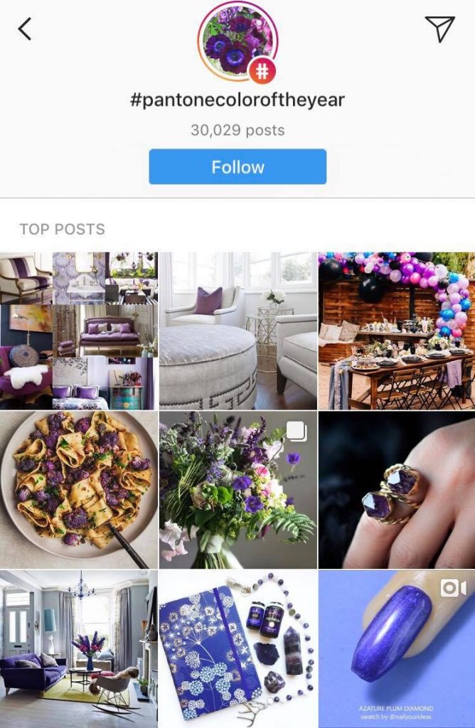
Instagram has become a necessity for creative businesses. The ability to regularly and easily reach out to folks with gorgeous pictures of your style or products (most of whom would’ve never heard of you otherwise) makes it a priceless tool. You can use #PantoneColorOfTheYear and post pics of your work incorporating Ultra Violet (or similar shades of purple … we can all appreciate a good vibrant purple, right?) and in doing so, you can reach people who follow that hashtag (a new-ish feature of Instagram which this designer LOVES.)


Look In Nature.

Everyone knows this is an Earth-friendly, back-to-nature era. If either of those descriptors speaks to your brand, seek out some lovely shades of purple found in nature that may apply to your brand. Verbena blossoms, lavender, and violets in your landscaping, violet-tinged sunrises on a job site, purple shadows cast in the snow, distant purple mountains to explore … think about how you can incorporate photos of the shades of Ultra Violet found in nature and then (for goodness sake) take some hi-resolution photos (or pay a professional to take them) to use on your website, in social media posts, in ads, in print materials, etc.


Get Psychological.

We’ve all heard at least the basics of the psychology of color. The psychology of the Color of the Year is a huge part of why it was chosen in the first place. From Pantone:

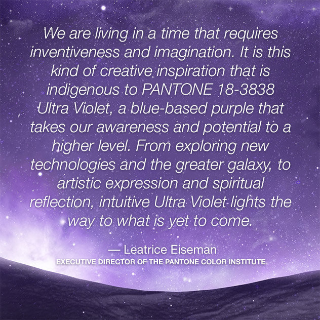
“Nuanced and full of emotion, the depth of PANTONE 18-3838 Ultra Violet symbolizes experimentation and non-conformity, spurring individuals to imagine their unique mark on the world, and push boundaries through creative outlets.”

(There’s a lot more on that HERE.)

Is your business concerned with health, science, or neuroscience/medicine? The HOWs and WHYs of color psychology can be discussed in blogs and social media posts, and the Color of the Year can be used as a jumping off point for discussions that are relevant to your brand.

Regardless of how you use PANTONE 18-3838 Ultra Violet, one thing is for sure: No one will accuse you of “playing it safe” with your color palette … unlike the 2006 Color of the Year Sand Dollar (seriously? It’s beige!) or the “meh” Cerulean (grey blue) of 2000. Take the big step – color your world!

5 Things To Know Before Designing (Or Redesigning) Your Logo

5 Things To Know Before Designing (or Redesigning) Your Logo

—Tips From a Graphic Designer—

You’re looking to define your brand with a new or updated logo, huh? Perhaps you’re ready to step out into the world with your shiny new business, or maybe you’re in desperate need of a refresh on your logo that’s old enough to be a college graduate. Or maybe you’ve made the grave mistake of designing your logo yourself and are now realizing you should have left the job to a professional. Whatever the case, here you are and you need some help.

Well, you are in luck. I’ve designed my fair share of logos and have learned much from the countless mistakes I’ve made over the years. One of the biggest lessons I’ve absorbed is this: Graphic designers need so much more information than you think! It is not enough to tell a graphic designer the name of your business and your favorite color.

You’ll need to KNOW exactly what you want to GET exactly what you want.

Take a look at this handy-dandy list of things to know before designing or redesigning your logo. Understanding what a designer needs from you (and why) can help make the design process a much more pleasant experience.

1. KNOW THYSELF.

  • Describe your brand in 3-5 adjectives, and be VERY specific (for example, if you describe your business as “high-end,” what do you really mean? Detail and quality? Sleek and modern? Cushy and expensive? Beware of using subjective words!)
  • What’s the personality and style of your business?

2. GATHER A VISUAL DICTIONARY.

  • Pinterest is a useful tool for this! Create a Pinterest board to share with your designer full of images that speak to the personality of your business.
  • Try not to focus on other business’ logos, but instead gather images that can be used as a visual dictionary for your brand. You may find that when viewing the images all together, a clearer picture of your business’ identity shines through.

3. UNCOMPLICATE THE COLORS.

  • Don’t get your heart set on a color for your logo simply because it’s your favorite. The color(s) chosen for your logo should represent your brand to your clients and customers, and getting set on one color can blind you to a better choice. It’s much better to begin by considering color families before choosing specific colors. (i.e. “I’d like to try a vibrant primary color.” or “I think a pastel would be great.” etc.)
  • Logos usually consist of 2-3 main colors, including a neutral color like black, grey, or white for a more professional look. Simplicity is the key. Logos that look amateur tend have too many distracting colors.
  • It’s a good idea to also choose a complimentary accent color (not in the logo) to use on your website and in print materials and ads.

4. HAVE A LITTLE FONT KNOWLEDGE.

  • It’s good to have a general sense of font “lingo.” You’ll be able to better communicate what you like and don’t like about a font if you know the vocab. You should know the difference between serif and sans serif at the very least. (It’s as simple as a quick Google search and you’re a capable adult.)
  • Your designer will have a CUH-RAZY number of fonts at their fingertips and they can customize these fonts to more closely and uniquely reflect your brand. Trust that if you’ve described your brand well to your designer, he/she probably has at least a few fonts to get the ball rolling.

5. LAYOUT: IT’S A LOGO, NOT A COLLAGE.

  • Let’s say it again together— Keep. It. Simple. Don’t try to cram your entire story into an icon. The simpler the logo, the more versatile it will be across a variety of platforms.
  • Will you need a symbol? Should that symbol represent the name of your business (like Target and Shell) or should you go with simple iconography (like Adidas and Nike)? Using a symbol can be extremely useful in representing your brand without saying a word.
  • Consider a letterform logo (like Coca-Cola and Kellogg’s) to give your brand a unique vintage or handcrafted feel. Using letterform on it’s own (without a symbol or emblem) is a great way to achieve these styles.
  • Do you need a tagline? Taglines can be useful to clarify your business’ mission, but keep in mind they can also clutter a logo. Consider using a tagline only for specific purposes, like the header of your website.

Designing a logo takes time, so prepare for at least 2-3 weeks of “sussing it out” before arriving at the final logo. Throughout the process, remember to keep an open mind to your designer’s choices. Chances are they probably spent an inordinate amount of time studying and practicing to perfect even the most insignificant detail of their craft. After all, you are paying for a designer. You should get your money’s worth. Use their years of experience and knowledge to your advantage and you won’t be disappointed with the result.

Why Use Infographics?

Infographics are becoming increasingly popular—and for good reason. Businesses and organizations can demonstrate their expertise on any topic in a visually appealing, social-media-friendly way that not only communicates complex information, but also helps folks retain that information quicker and more effectively. Here, why don’t I just explain the benefits of using infographics WITH an infographic. Enjoy.